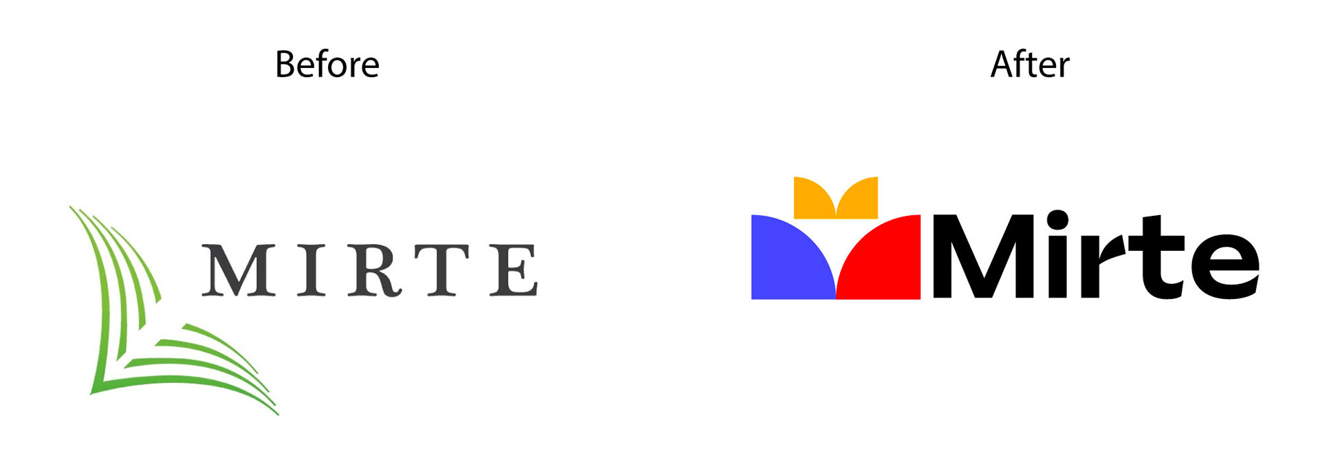
Marketing research revealed that the existing brand identity was perceived by potential clients as “outdated,” which hindered the company’s growth and expansion.
The new logo needed to convey a strong association with knowledge and education, reflect the company’s leadership in the market, and remain simple and distinctive enough to work as a favicon, social media avatar, or be printed on any promotional material.
It’s a creative process of discovering the concept and building a visual metaphor.

The final outcome was a clean, modern symbol designed using basic geometric forms.
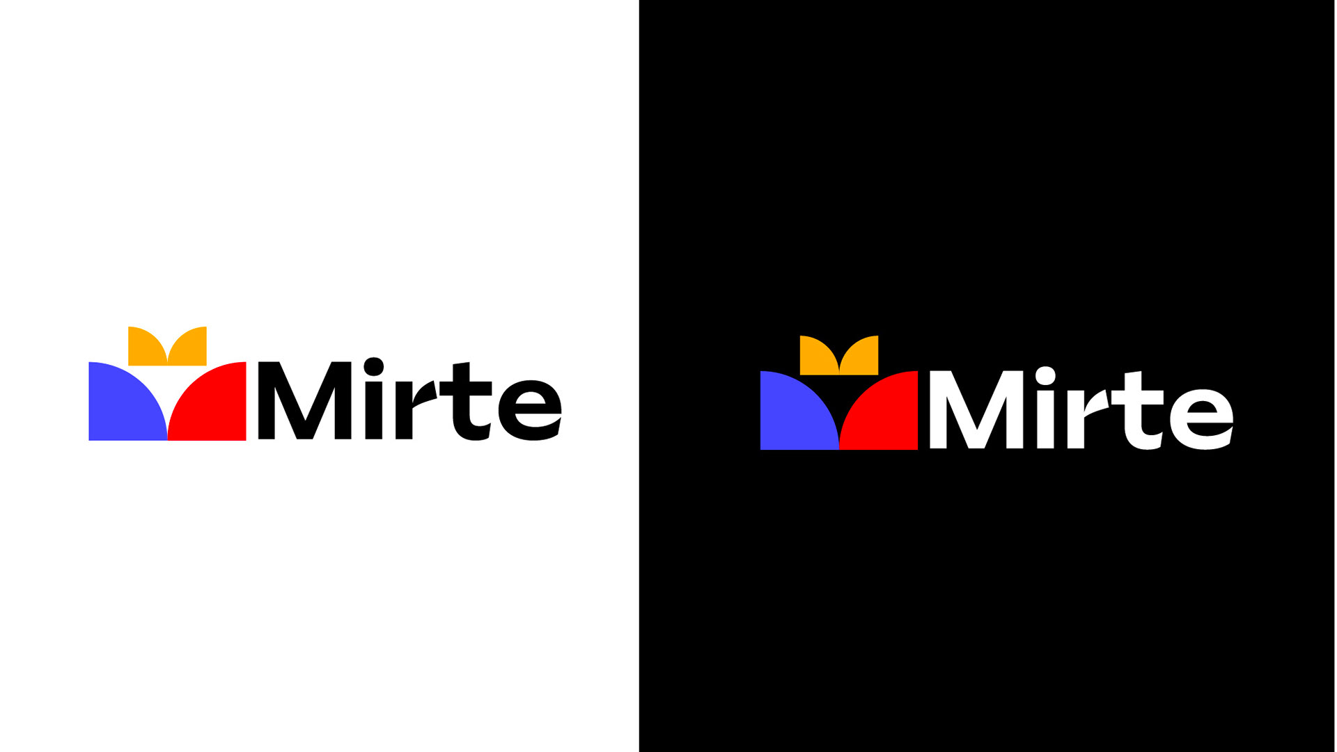
The new mark works equally well on dark and light backgrounds and can be seamlessly adapted into a pattern for use in a wide range of branded materials.
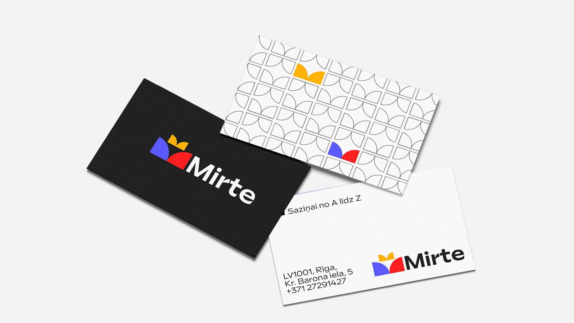

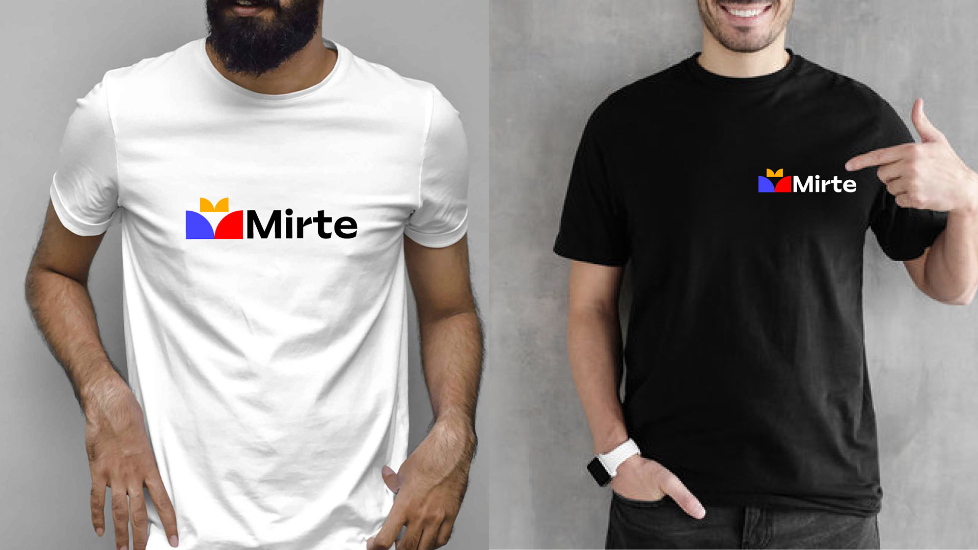
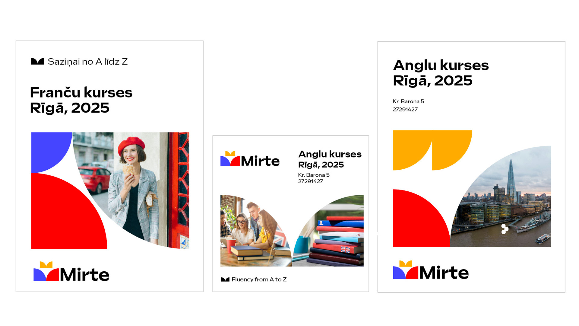
The simplicity of geometric forms allows for limitless creative applications across all types of print and digital media.