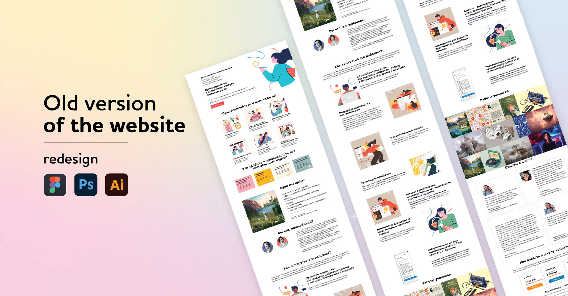
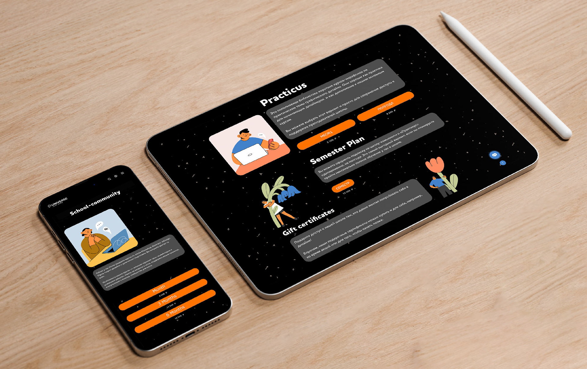
The website design was created several years ago when the trend was for designs with lots of white space and flat-style illustrations. The goal of that design was to convey a cozy atmosphere of a friendly community. Additionally, it was meant to help website visitors focus on the text description of a new service at that time—subscription-based learning.
Over time, this style became outdated, and an analysis of the heatmap and user experience showed that some blocks on the site could be shortened or removed entirely (for example, the 'How it Works' block gradually became irrelevant as subscription-based learning was no longer a novelty)
In addition, we discovered during interviews that:
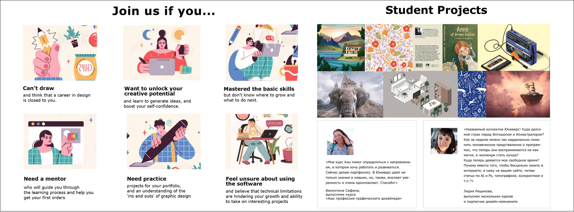
• The student projects graduates consistently attracted interest, but users didn't always understand the essence of the assignment. It was necessary to show on mockups what specific tasks the students were solving.
• Student reviews were very important. However, long, small text didn't capture interest.
• The large 'Join us if you…' section, which described the profiles of those interested in learning, contained too many illustrations. The images distracted all attention from the text, leading people to ignore it.
1. Our secondary research revealed that a good video with the instructor is more convincing than illustrations.
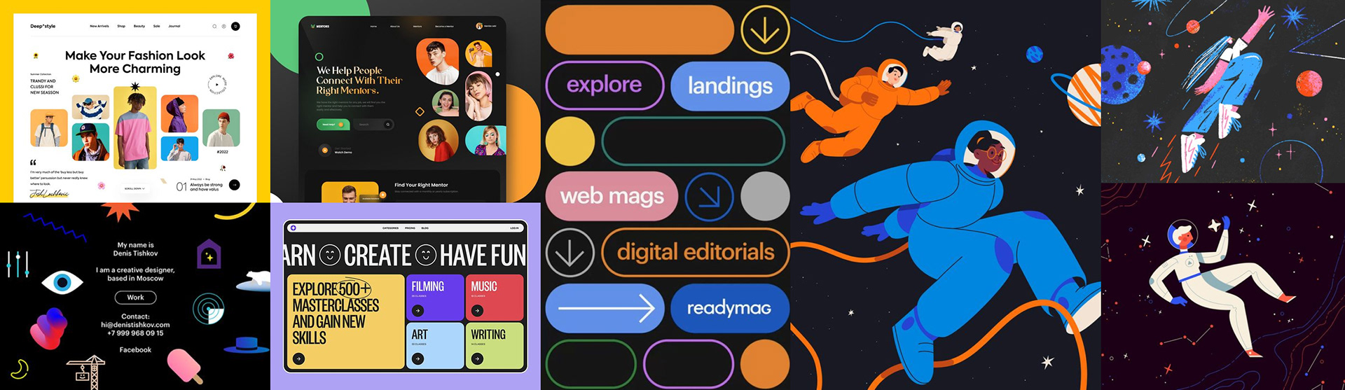
2. We decided to design the buttons and widgets with rounded corners. First, this makes the design softer and more welcoming. They are perceived as less aggressive and more friendly compared to sharp corners. Second, this style is often associated with modern and updated design, creating the impression that the site is at the forefront of current trends. The illustrations for the previous version of the website were created by different authors, resulting in noticeable style discrepancies.
3. Therefore, it was decided to have all the illustrations on the site created by a single illustrator. Their style became more minimalist and aligned with the new rounded elements in the site's design.
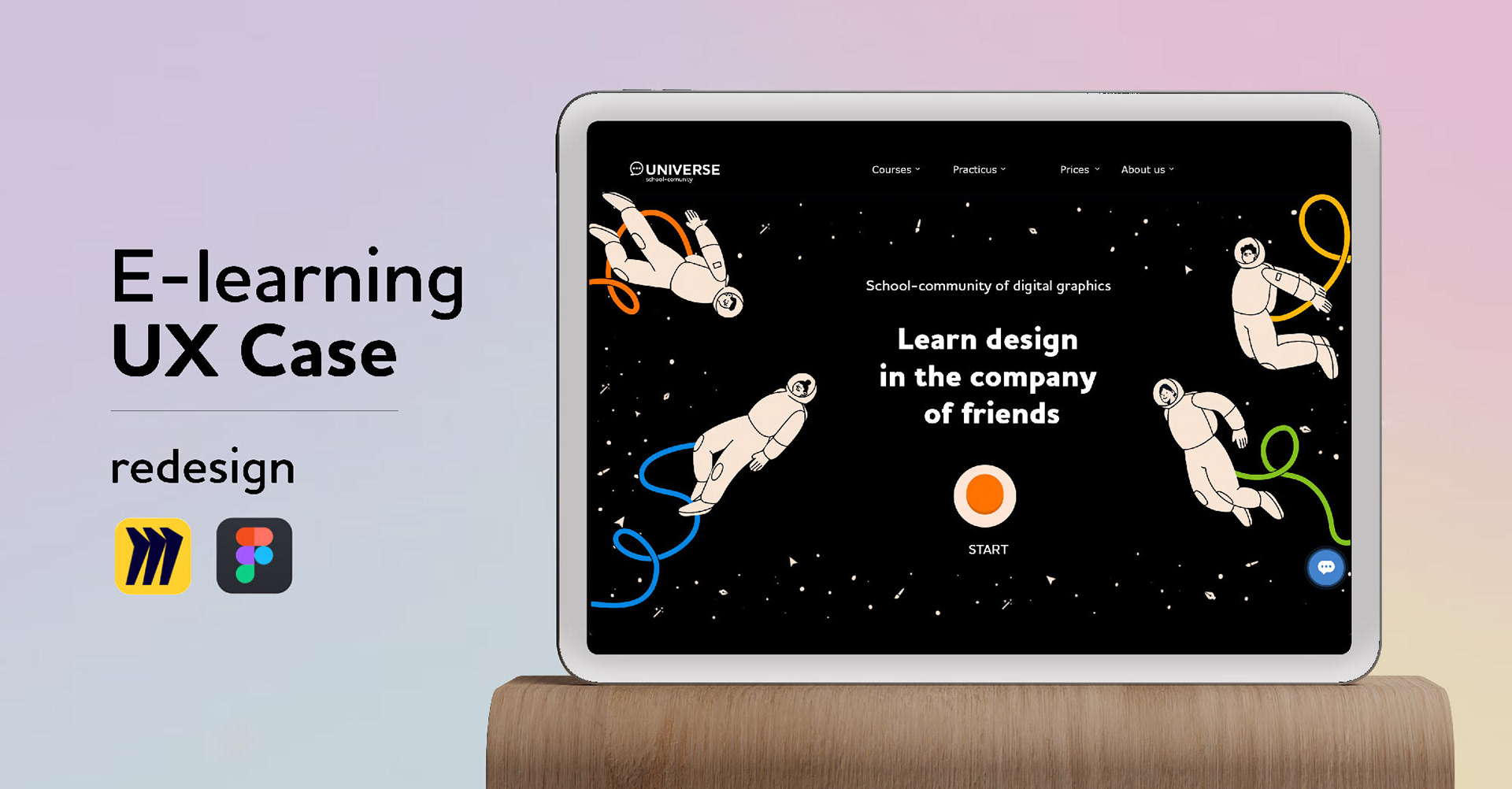
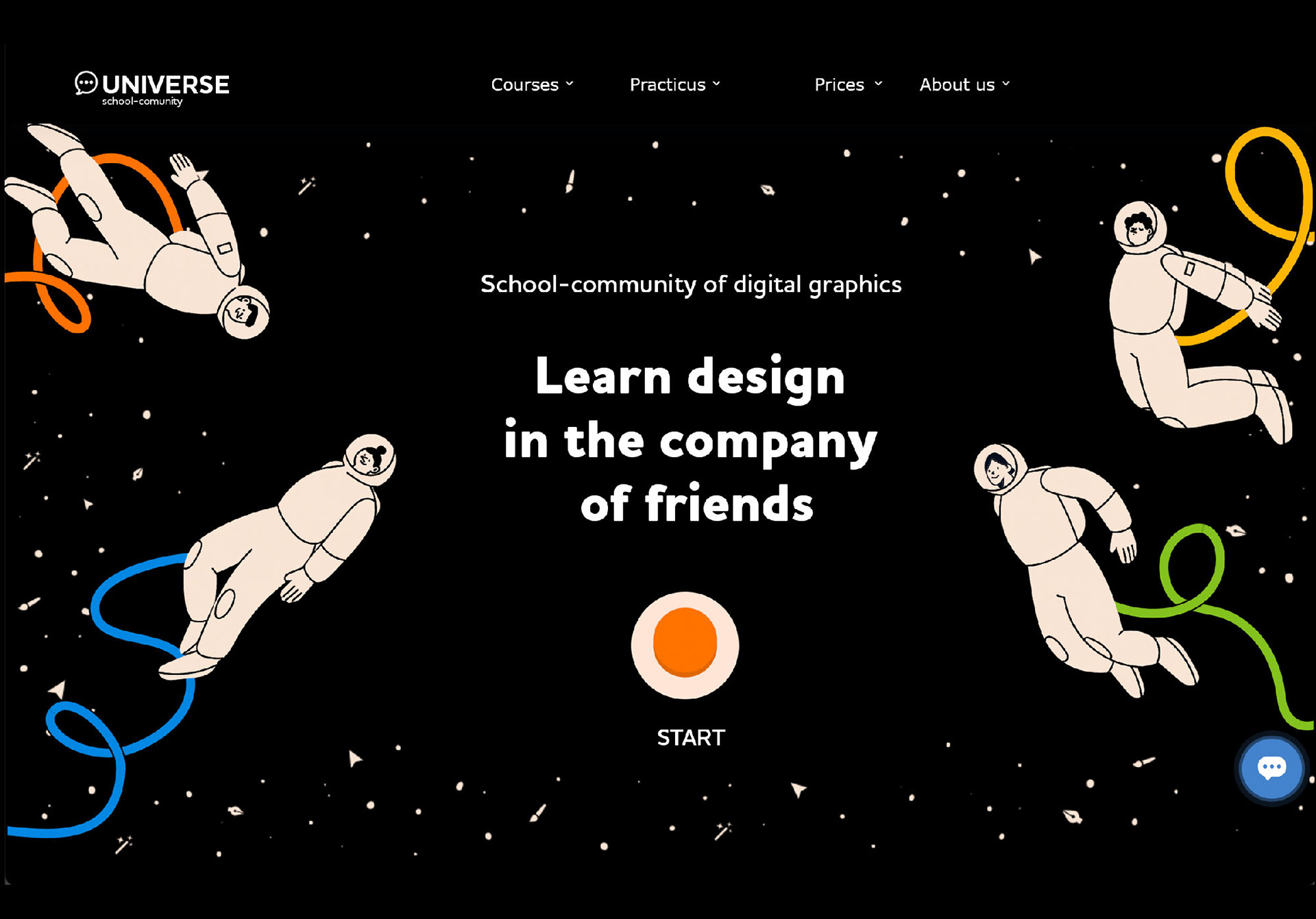
4. We also decided to change the color palette, making the primary background of the site black, similar to the Dark Mode popular in operating systems and applications. Additionally, black helps to focus more on the content and highlight important interface elements, such as call-to-action (CTA) buttons, creating a clear visual hierarchy.
For illustrations and secondary elements, we chose calm, warm shades reminiscent of print design. For the CTA buttons, we selected an ultra-bright orange color.
For illustrations and secondary elements, we chose calm, warm shades reminiscent of print design. For the CTA buttons, we selected an ultra-bright orange color.
We created a moodboard showcasing the future style of elements and illustrations.
We received positive feedback from users after showing them the first mid-fi prototype.
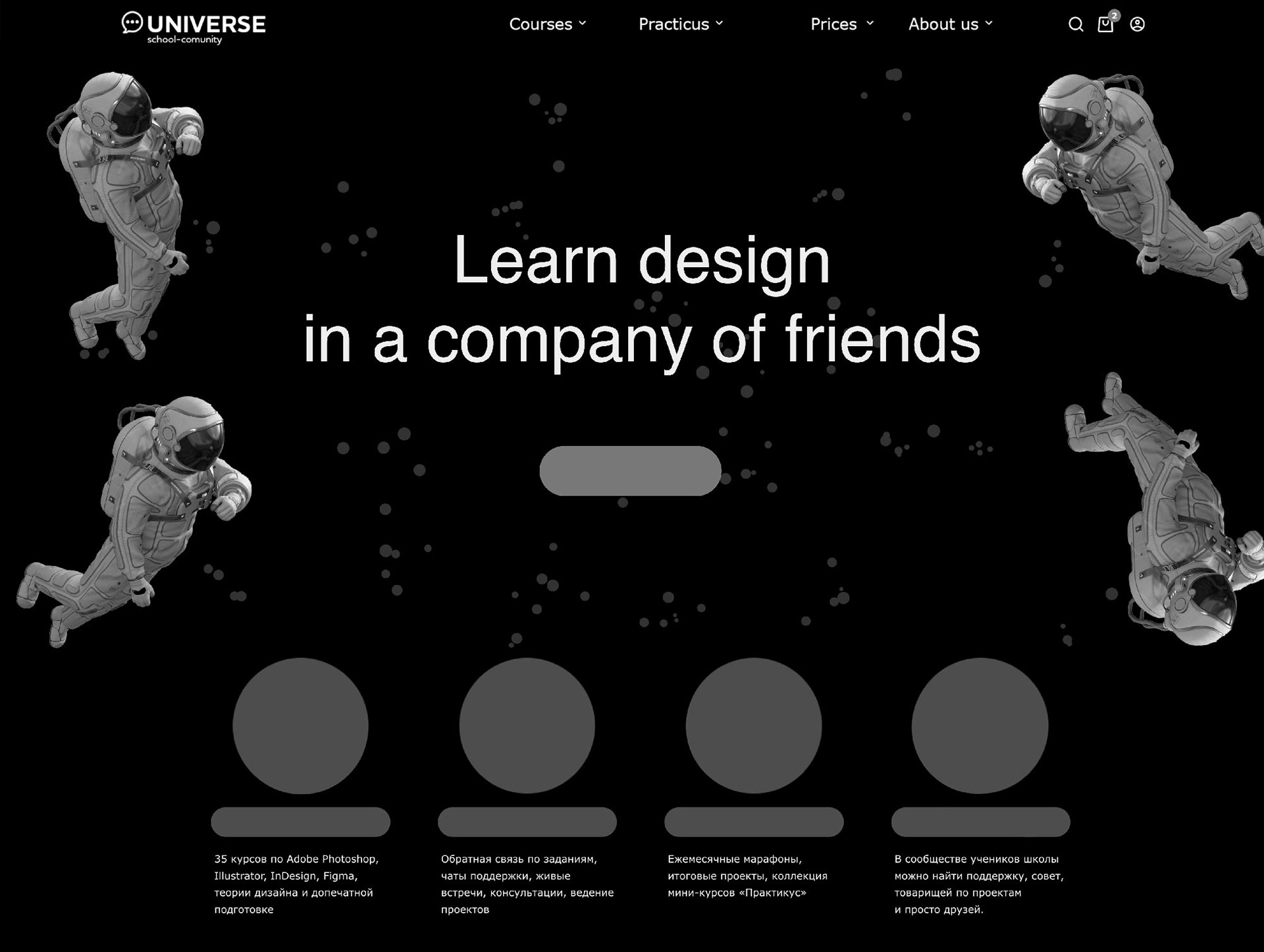
For the homepage, we decided to use an image of astronauts, as their work is associated with a scientific approach and overcoming challenges. Besides, the school is called 'Universe.' The main innovation was the simple roll-over animation of the astronauts, intended to highlight the modernity of the design and bring a smile to viewers.
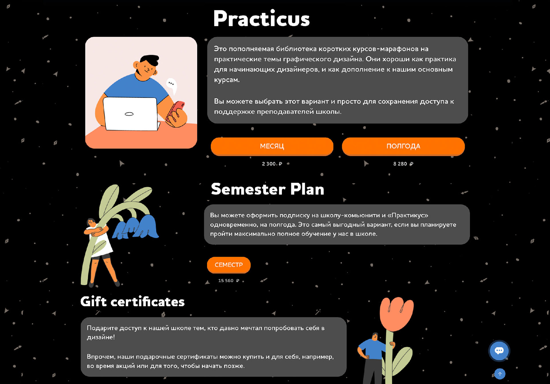
The transition to a website design similar to a messenger chat—important information is placed in colored blocks with rounded corners. The section blocks alternate from left to right.
The use of bright orange buttons with CTA labels and headlines made up of key words, helping users grasp the overall meaning without even reading the full text.
The use of bright orange buttons with CTA labels and headlines made up of key words, helping users grasp the overall meaning without even reading the full text.
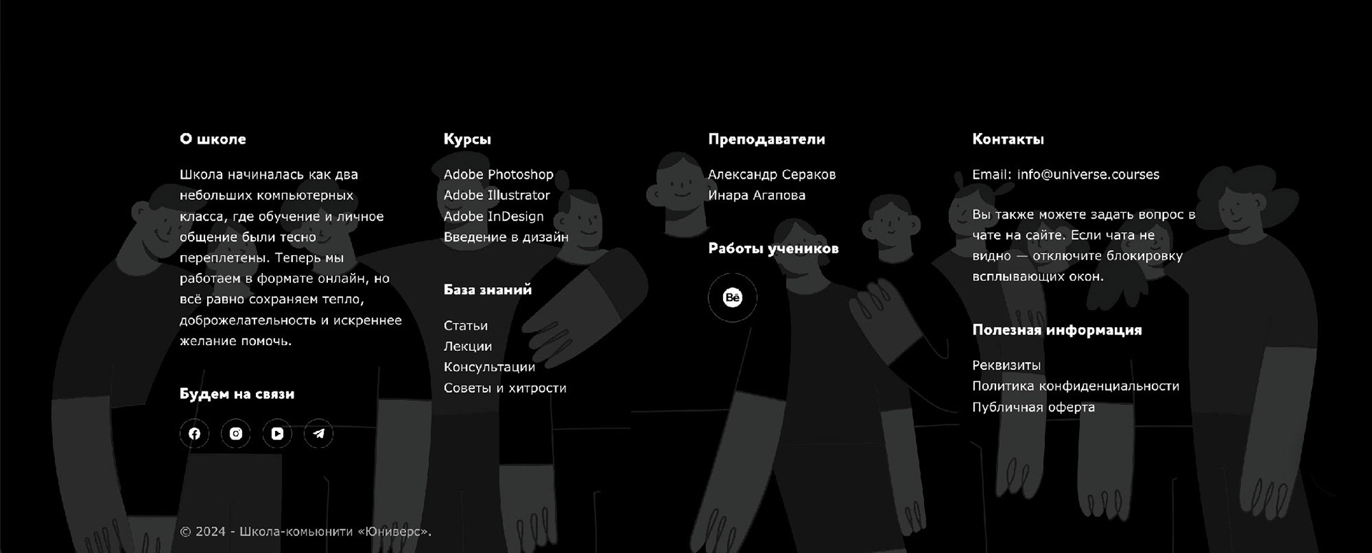
Adding a massive footer at the bottom of the page, consisting of links to all important site pages and essentially serving as a brief list of all the school's areas of activity.